Feeds:
Posts
Comments

Archive for the ‘Physics’ Category

              I continue to be fascinated by the RGB color scheme, and extra-spectral colors in particular.  And the NFL football season starts tonight.  And so I ponder: are there any patterns/trends in the official team colors of the 32 NFL teams?  Well, I’m glad you asked.

              First of all, here are the “official” colors of the teams with their exact RGB ratings.  You will notice that there are a few teams that, perversely, have more than two team colors.

LocaleTeam nameColorRGB
ArizonaCardinalsgold25518218
ArizonaCardinalsred1513563
AtlantaFalconsred1672548
AtlantaFalconssilver165172175
BaltimoreRavensgold15812412
BaltimoreRavensred1981214
BaltimoreRavenspurple262595
BuffaloBillsred1981248
BuffaloBillsblue051141
CarolinaPantherssilver191192191
CarolinaPanthersblue0133202
ChicagoBearsorange200563
ChicagoBearsnavy112242
CincinnatiBengalsblack000
CincinnatiBengalsorange2517920
ClevelandBrownsbrown49290
ClevelandBrownsorange255600
DallasCowboysnavy03468
DallasCowboysblue053148
DallasCowboyssilver134147151
DenverBroncosorange2517920
DenverBroncosnavy03468
DetroitLionsblue0118182
DetroitLionssilver176183188
Green BayPackersgold25518428
Green BayPackersgreen244840
HoustonTexansblue33247
HoustonTexansred1672548
IndianapolisColtsblue04495
IndianapolisColtsgray162170173
JacksonvilleJaguarsgold21516242
JacksonvilleJaguarsdark gold15912144
JacksonvilleJaguarsteal0103120
Kansas CityChiefsgold25518428
Kansas CityChiefsred2272455
Las VegasRaidersblack000
Las VegasRaiderssilver165172175
Los AngelesRamsyellow2552090
Los AngelesChargersgold25519414
Los AngelesRamsblue053148
Los AngelesChargersblue0128198
MiamiDolphinsorange252762
MiamiDolphinsaqua0142151
MinnesotaVikingsgold25519847
MinnesotaVikingspurple7938131
New EnglandPatriotsred1981248
New EnglandPatriotsnavy03468
New EnglandPatriotssilver176183188
New OrleansSaintsblack162431
New OrleansSaintsgold211188141
New YorkGiantsred1631345
New YorkJetsgreen188764
New YorkGiantsblue13582
New YorkGiantsgray155161162
New YorkJetswhite255255255
PhiladelphiaEaglesgreen07684
PhiladelphiaEaglessilver165172175
PittsburghSteelersgold25518218
PittsburghSteelersblack162432
San Fran.49’ersred17000
San Fran.49’ersgold17315393
SeattleSeahawksgreen10519040
SeattleSeahawksnavy03468
SeattleSeahawkssilver165172175
Tampa BayBuccaneersorange2551210
Tampa BayBuccaneersred2131010
TennesseeTitansred2001646
TennesseeTitansnavy123564
TennesseeTitansblue75146219
WashingtonFtbl. teamburgundy631616
WashingtonFtbl. teamgold25518218

I’ve already had to make a few judgement calls.  For example, most teams have three team colors: two typical colors, and then either white or black.  In most cases I’ve thrown white or black out, unless they are one of the two main colors (in my opinion).  For instance, the Cincinnati Bengals are orange and black.  I’ve only held onto three colors if I feel they are crucial to their color scheme.  The Dallas Cowboys are particularly meretricious in this regard.  They claim no less than five colors: white, blue, navy blue, royal blue, and silver.  Based on my own aesthetic color sense I have pared this down to three.

              Also note that I have renamed the colors in most cases.  Many of the teams copy one another, using the exact same colors, but call those colors by different names.  The most egregious example is the color (0,34,68) which is used by four different teams.  Dallas calls this blue, Denver calls it Broncos navy, New England calls it nautical blue, and Seattle calls it college navy.  I just call it blue.

              Only one team has a “pure” RGB color: the San Francisco 49’ers have red (170,0,0).  You gotta give ‘em props for going all-in on red.  I guess (255,0,0) was too “bright” so they darkened it a little, but hey.

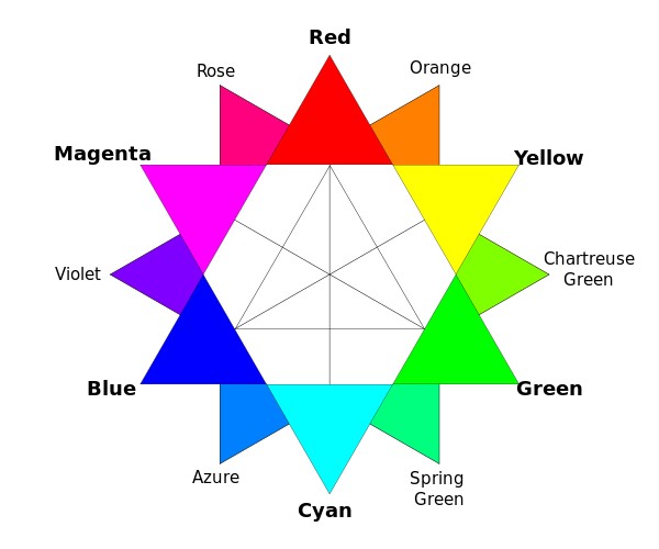
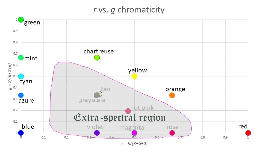
             So, is there a way to visualize this data in a graph?  The problem is displaying 3-tuples in two dimensions.  Luckily, there is a way to do this.  It’s called a chromaticity graph.  Define three new variables thus:

r = R/(R+G+B)

g = G/(R+G+B)

b = B/(R+G+B)

You can think of these variables as indicating the relative percentage of each core color, without regard to brightness.  So magenta (255,0,255) has values r = 0.5, g=0, b = 0.5, indicating that magenta is half red, half blue.  Similarly, chartreuse (128,255,0) has values r = 0.333, g=0.666, b = 0, indicating that it is 1/3 red and 2/3 green.

              Now consider plotting r vs. g.  You might think you’ve “lost” information about the value of b, but that is not the case.  Since r + g + b = 1 is necessarily true, you could always recreate the value of b if you needed it.

              Here is a plot of r vs. g, which is a chromaticity graph:

Where you have lost information is in the value of “brightness”.  For example, white (255,255,255), gray (128,128,128) and black (0,0,0) are all plotted at the exact same coordinate (r,g) = (0.333,0.333).  And blue (0,0,255) and dark blue (0,0,128) look very different, but again they map to the same point (r,g) = (0,0).

              Note that most of the “standard” colors we have names for appear on the outer edge of the triangle (since one of the three variables R,G,B is zero).  The exceptions are the grayscale colors (white, gray, black) which are at the center of mass of the triangle, and other extra-spectral colors like tan or hot pink.

              Speaking of extra-spectral colors: there are two main ways to “construct” them.  You can either:

  • mix all three colors R,G,B in roughly equal measure, or
  • mix R and B with very little G.

With this in mind, we see that the extra-spectrals occupy the middle portion of the triangle, as well as the bottom edge:

              OK, so back to my original goal…visualizing the NFL team colors.  Here is a chromaticity plot of all the team colors in the above table:

What trends do you notice?

  • There are plenty of reds, of all varieties.
  • All the blues have a major element of green as well.  That is, there is a cluster of colors around azure and cyan, but no true blues.  The blue with the least green is Buffalo Bills blue, at g = 27%.
  • There are no true greens.  In fact, there are few greens at all.  The maximum green is g = 57% for the Seattle Seahawks.
  • There are no pinks: nothing anywhere close to magenta.
  • There is almost a “main sequence” like in an H-R diagram, running from cyan to gray to yellow.  Why do so many NFL colors have g ≈ 33%?
  • There is a huge cluster of colors around “gold”.

I’m sure you can find other patterns.  Here is a map of the “under utilized” colors for NFL teams:

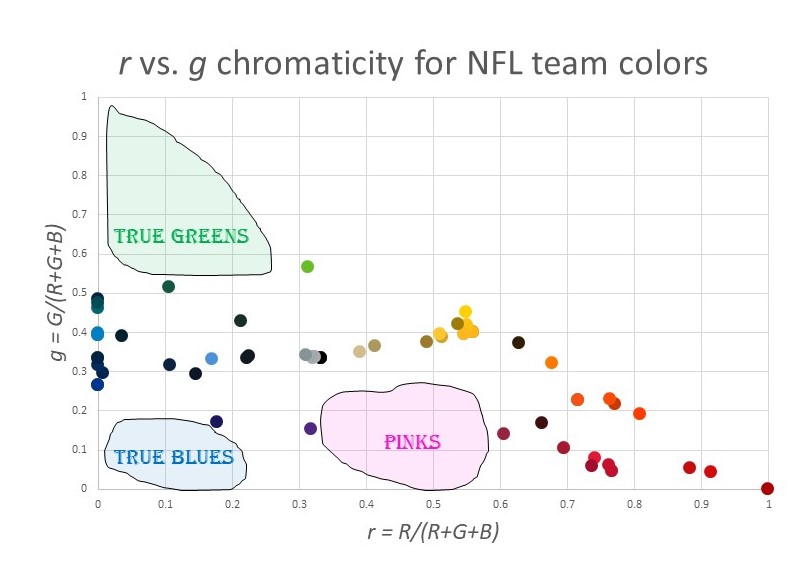
The pink/magenta thing makes sense.  For some reason, people think these are not masculine colors.  (This was not always the case.  Pink used to be associated with boys.)  But what about the lack of green?  And the lack of true blue without green?  I have no idea.  Maybe someone can enlighten me.

Read Full Post »

Here’s a meme stolen borrowed from a young-Earth creationist:

tennis ball.jpg

First of all, why are so many creationists these days becoming flat-Earthers?

But secondly, does this meme even make sense to you?  I can understand (sort of) the confusion that a spinning tennis ball might bring: water is flung off the ball, rather easily, so why isn’t ocean water flung off the earth?  That’s a valid physics question.  But what in the name of Odin does this have to do with gravity?

Let’s do the physics.  Suppose there’s 0.25 kg of water on the ball to begin with (corresponding to roughly ½ cup).  The radius of a tennis ball is about 6.0 cm = 0.06 m.  The rotation rate of a served tennis ball is typically around 2200 rpm = 230 rad/s.  Therefore the linear velocity on the ball’s surface is v = ωr = 230 (0.06) = 13.8 m/s.  So the force needed to keep the water on the ball (i.e. to make it move in a circle contrary to Newton’s 1st Law) is F = mv2/r = 0.25 (13.8)2 / 0.06 = 794 N, which is about 178 pounds of force.  It’s not surprising the water is flung off: what force is there that could possibly do the trick?  The water would have to be “stuck” to the ball with a force of at least 794 N in order to stay in place.  (Gravity won’t do: the force of gravity between ½ cup of water and a tennis ball is easily found to be 2.7 x 10⁻¹⁰ N, which is basically zero.)

OK, so what about water on the Earth?  The Earth is spinning, too.  Shouldn’t any water on the Earth’s surface be flung off?

Suppose I have half a cup of water on my desk.  Its mass is the same as in the previous example, but the radius of its motion is much bigger: 6,370,000 m, the radius of the Earth.  (I’m assuming for simplicity’s sake that I’m at the equator.)  Now, the half cup of water’s rotation rate is 1 revolution every 24 hours, or a rotational velocity of ω = 7.27 x 10⁻⁵ rad/s.  Even though this is pretty small, we still get a fairly large v = ωr = 463 m/s.  That’s your (linear) velocity at the equator, and it’s pretty big.  So far, it still seems plausible that water might be flung off.

But wait:  how much force is needed to prevent this?  Well, F = mv2/r = 0.25 (463)2 / 6,370,000 = 0.008 N, corresponding to the weight of less than a gram of mass.  Therefore, to not be flung off the Earth, a half cup of water needs only 0.008 N of force to be held in place.  Even without gravity, a tiny dab of scotch tape would be sufficient.  But there is gravity.  And in fact, gravity supplies a force of F = mg = .25 (9.8) = 2.45 N, or more than half a pound.

Seeing water flung off a tennis ball, it’s natural to wonder why water doesn’t get flung off a spinning Earth.  After all, we’re all moving pretty darn fast on this ride.  But the Earth’s radius is huge, so the force of gravity is more than adequate to keep things in place.  The fact that water is not flung off doesn’t mean gravity is a hoax, it means gravity is doing its fucking job.  The cure for this flat Earth bullshit is to take a basic physics class.

You fucking morons.

Read Full Post »

Let’s watch a clip from the movie Superman II, which I saw in the theater in 1980:

Great acting, right?

From the time (Δt) that the kid is in the air, we can determine how high Niagara Falls (ostensibly) is.  I get Δt = 27 s, so the height of Niagara Falls is given by

H = ½ a Δt2 = ½ (9.8) 272 = 3572 m.

Wow!  That’s big…more than 3.5 km.  That’s over two miles high!

(It’s actually higher than this, if we notice that Superman didn’t even catch the kid at the very bottom.)

In point of fact Niagara Falls is 51 m high.  Only half a football field.  In the real world, it would take the kid (neglecting air resistance) all of 3.2 seconds to hit the rocks below.  Superman has no time to change his costume; Lois has no time to scream for help.  3.2 seconds, then splat.

Let’s ponder the magnitude of the error the filmmakers made here.

MOVIE: 3572 m

REALITY: 51 m

This is a 7000% error.  That has to be some sort of record.

To put it into perspective, it would be like listing Shaquille O’Neal’s height as 165 yards, instead of 7’1″.  This is fun!  In the world of Superman II, Oslo has a population of 43 million, Gone With the Wind has a running time of almost 12 days, the moon is almost as massive as the Earth, and the average cat weighs 630 lbs.

The movie supposedly grossed $190,000,000.  We now know, however, that (given the 7000% inflation trend in Superman II) the move only grossed $2,700,000.

This makes Superman II the greatest flop of all time.  For some reason, though, when I saw it around my 12th birthday, I liked it.  Maybe that’s because it was really my 840th birthday?

Read Full Post »

I’ve talked in the past about the RGB color scheme, and about extra spectral colors.  Here I want to ask a specific question: why do some RGB color combinations have names, while others do not?

First, a review.  Most (but not all!) colors that humans can perceive can be represented (approximately) by a set of three numbers (R,G,B) where each variable runs from 0 to 255.  Roughly speaking, a 0 is “none” of that color and 255 is “maximum” of that color.  Thus (0,0,0) is black, (255,0,0) is red, etc.  What’s interesting is which combinations get names in English, and which do not.

Suppose two colors are maxed out.  (255,255,0) is equally red and green; if you’re familiar with color addition, you know this is yellow.  Similarly, (255,0,255) is magenta, and (0,255,255) is cyan.  So far, so good.

Now suppose one color is maxed, and another is at half value.  Here’s where things get interesting.  Consider (255,128,0), which is (in a sense) halfway between red (255,0,0) and yellow (255,255,0).  Not surprisingly, (255,128,0) is called orange.  But what about halfway between yellow and green, i.e. the color (128,255,0)?  Mathematically, this should be as unique a color as orange, but (sorry) it just looks like a different shade of green to me.  Why is that?  What’s special about (255,128,0), but not about (128,255,0)?

It turns out that (128,255,0) has a name: chartreuse.  But probably only one person out of twenty could identify chartreuse out of a line-up.

If you want to experiment, try the other “halfsies” using this RGB applet.  The combinations you should test are

(255,128,0) = ORANGE

(128,255,0) = CHARTREUSE

(0,255,128) = ?

(0,128,255) = ?

(128,0,255) = ?

(255,0,128) = ?

Only one of these is obvious to me, i.e. the color (0,128,255) which is halfway between cyan and blue.  That’s the color of a clear sky, and is known in English as azure.

Do any of these combinations have unique names in other languages?

Here’s a modern-day color wheel (thanks, Wikipedia!), which puts all of this into perspective:

colors

[Note that “violet” here isn’t really true violet (as in a rainbow), which cannot be represented on an RGB computer monitor.]

Are these the names you came up with?  Personally, I called (0,255,128) “dark mint green” instead of Spring Green, but what do I know.

And here we get to the psychology of color, which is the main point of this post.  Look at the trifecta of red/orange/yellow: most people would classify those as three really distinct colors.  Now look at the trifecta chartreuse green/green/spring green.  Those all just look like green, to me.  They aren’t as distinct.  And I think the reason is completely in my mind.

Think back to when you studied color in kindergarten.  The “primary” subtractive colors were red/yellow/blue.  [That’s now known to be bullshit, of course; there are no three canonical primary subtractive colors; we instead make a choice of three primaries based on what colors those three could possibly make upon mixing (this is called the gamut) and  cyan/yellow/magenta gives a better gamut than red/yellow/blue.  Put another way, if you only had three crayons, then choose cyan/yellow/magenta instead of red/yellow/blue because more mixed colors will be available to you.]  Anyway, now look at the RGB wheel and find red/yellow/blue.  They aren’t equidistant.  Something is wrong.

Here’s my thesis: I think that the red/yellow/blue bullshit we lived through at the age of 6 has biased us towards thinking that red and yellow are more different than they really are.  Look at the wheel again.  In terms of RGB numbers, red and yellow are as similar as blue and cyan.  Hard to believe, I know, but that’s the way the cookie crumbles.

One final thought: in English, in kindergarten, when you mix white with red, you get pink.  What about mixing white with green?  Or white with blue?  How come there aren’t unique names for those colors?

(255,200,200) = PINK

(200,255,200) = ?

(200,200,255) = ?

Read Full Post »

You probably learned about projectile motion in introductory physics class. If you throw something (a baseball, say) then its horizontal motion will remain constant, whereas its vertical motion will change under the influence of Earth’s gravitational pull. The result is a parabolic arc, right?

Well, no. Saying that projectile motion is parabolic is only an approximation.

In class, I “prove” that the motion of the baseball is a parabola, but in order to do so, I make the (reasonable) assumption that the effect of gravity is a constant. That is, I assume that the vector g (the acceleration due to gravity) always points in the same direction all along the trajectory.

This is actually not quite true, however. I’ve neglected the curvature of the Earth.

Now, this isn’t really a big deal when throwing baseballs. Suppose you toss a ball to your friend 50 m away. The vector g for you does point in a slightly different direction then g for your friend, but the angular difference is miniscule…it’s about 50/637,000,000 radians, or 0.00045 degrees. This is so small that I am comfortable pretending that the two g’s are actually parallel, and the derivation thereby leads to a parabolic arc.

But what if you don’t make that approximation? What answer do you get?

You get an ellipse. You get an orbit. And here’s the point of my post:

Every time you throw an object, the object is (temporarily) in orbit until it hits the ground.

Here’s the orbit of a thrown baseball (not to scale):

orbit1

Now suppose the Earth had the same mass, but was the size of the Little Prince’s home asteroid B-612, which is as big as a house. The orbit is the same, but this time the baseball doesn’t strike the surface:

orbit2

The takeaway is that all projectile motion is really orbital motion. I find this fascinating: you don’t need a fancy rocket to launch something into orbit. Your arm will suffice. It’s just that you need the Earth to not be in the way.

Read Full Post »

There’s been a lot of press lately about all the plastic crap in our oceans. For example, this Mother Jones article of a week ago has metastasized and been re-posted many times. In the article, there are some (seemingly) alarming claims, such as:

  • There are up to 28 billion pounds (12.7 million metric tons) of plastic in the oceans;
  • There’s an accumulation of junk (the great Pacific garbage patch) which is twice the area of Texas.

M972418479af64f8fd4710e9e14e4494d

Now, I will be the first person to condemn pollution, promote biodegradability, and sing the praises of sustainability. However, these numbers (if taken at face value, and I have no reason not to) don’t necessarily make a very strong case that the oceans are filled with junk.

The problem is that the oceans are just so ridiculously huge to begin with.

Let’s do some simple math. All of the oceans on the planet have a combined volume of about 1.3 billion km3, which is 1.3 x 10¹⁸ m3. At roughly 1000 kg/m3, this has a total mass of 1.3 x 10²¹ kg, which corresponds to a weight of 2.87 x 10²¹ pounds. So we get the following ratio:

28 billion pounds ÷2.87 x 10²¹ pounds = 9.8 x 10⁻¹².

That’s a pretty small fraction. To put it into perspective, let’s say the world’s oceans were an Olympic sized swimming pool, with volume of 2500 m3 and a mass of 2.5 x 10⁶ kg. On this scale, all of the plastic in all the world’s oceans would have a mass of (2.5 x 10⁶ kg) x (9.8 x 10⁻¹²) = 24.5 mg, which is about the mass of a housefly.

Let me stress: all the plastic we’ve dumped in all the oceans is about like a housefly tossed into an Olympic-sized swimming pool.

swimming

But what about that Texas thing? A pile of junk, twice the size of Texas, just floating around? That has to be bad, right?

The area of the world’s oceans is ~3.6 x 10⁸ km2. Twice the size of Texas is 2 x 696,241 = 1.39 x 10⁶ km2.

This gives a ratio of 1.39 x 10⁶ km2/3.6 x 108 km2 = 0.0039 = 0.39%. That’s small, but a much bigger fraction that before. Not surprisingly, our plastic junk takes up a higher fraction of the oceans’ area than it does the mass, because the junk floats on the surface.

Returning to the Olympic sized swimming pool: its area is 50 m x 25 m = 1250 m2. Since 0.39% of that should be floating junk, we get 1250 m2 x 0.39% = 4.875 m2. That’s a floating trash pile 2.2 m x 2.2 m on a side, bigger than the area of a swimmer…it’s about the area of two pool floats. That’s big enough to notice. That’s big enough to worry about.

To summarize: the great Pacific garbage patch is like two pool floats in an Olympic sized swimming pool.  But these are thin floats: remember, they can’t weigh more than a housefly!

foam-pool-float-pink

This analysis is optimistic and pessimistic in equal measures. On the one hand, in terms of mass, the amount of plastic we’ve chucked into the ocean is a pittance, in part because the oceans are so deep. On the other hand, since plastic floats, it takes up a disproportionate amount of the oceans’ surface area (a place where most marine life lives anyway). Even if it’s less than 1% of the area of the whole pool, a couple of pool floats is certainly a distraction if Olympic swimmers are trying to have a race. My suggestion is that we should strive to…

Oh, who am I kidding. Look at this graph (again, from that Mother Jones article):

plastic-ranking_1

If China doesn’t change its ways, it doesn’t matter what we do.

Read Full Post »

I’ll start with a limerick:

The Becquerel has me morose;

These units I can’t diagnose.

The rads and the Grays

Don’t measure decays—

But what of equivalent dose?

becquerel_postcard

1 Becquerel = 1 decay/s

There are at least seven units of radioactivity floating around out there, measuring at least three different kinds of things; a veritable zoo of scientific terms. Unfortunately, most people don’t know a rad from a Gray from a Becquerel. Here, then, is my attempt to sort out the confusion.

You’re welcome.

First, let me just say that most people (to my dismay) equate the terms “radioactivity” and “radiation”. There’s some disagreement on the meanings of these terms; I find myself in the conservative camp on this issue. To me, “radioactivity” refers to junk flying out of an unstable nucleus: alpha particles, gamma rays, and the like. “Radiation”, on the other hand, refers exclusively to electromagnetic radiation (anything from long-wavelength radio waves to ultra-short-wavelength gamma rays). By my fuddy-duddy standards, “radiation” is just light; it may or may not be biologically dangerous. Radiation is just one of the possible kinds of radioactivity.

Unfortunately, through the inevitable process of “language creep” (the same process by which the original four “collie” birds became four “calling” birds in the Twelve Days of Christmas, because people are just ignorant) the term “radiation” has come to encompass any ionizing junk from a nucleus.  So some people now call alpha particles and beta particles “particle radiation” to distinguish them from gamma rays, which is “electromagnetic radiation”. This usage bothers me, but I’ll get over it. Just note that I won’t use this terminology here.

So: unstable nuclei exist. They occasionally spit out things—a phenomenon I call radioactivity. These things can often knock electrons free from atoms (i.e. they can ionize atoms). Such ionization events can be detected by a Geiger-Müller tube (among other devices).

Activity. The first way to measure radioactivity is to measure these ionization events in a given amount of time, which in turn tells you how often decays are occurring. So we measure R, the “activity” of a nuclear sample. The metric system unit of activity is the Becquerel (Bq), which is defined to be one decay/second. (Note that 1 Bq is essentially equivalent to 1 Hz = 1 s–1.)

Unfortunately, the Becquerel is a small unit—if we’re talking about radioisotopes used in medicine, for example, we might have to speak of billions of Becquerels. So there’s another unit of activity: the Curie (Ci). One Curie is defined to be the activity of 1 gram of 226Ra. If you want to convert, 1 Ci = 3.7 x 10¹⁰ Bq.

There is a problem with measuring activity: it doesn’t really tell you how dangerous a particular sample is. Not all radioactivity particles are the same. Getting hit with millions of weak particles might be preferable to being hit by only a few high velocity ones. One bullet is more dangerous than 500 rapidly-fired marshmallows.

Absorbed dose. To get a feel for the dangerousness of a sample, we talk about absorbed dose: a measure of energy absorbed per kilogram of target material. In metric units, the applicable unit is the Gray (Gy): 1 Gy = 1 Joule/kg. Other people use the rad, with the conversion 1 rad = 1 erg/g = 0.01 Gy. Use of the rad is discouraged by the international scientific community but is still common in (surprise surprise!) the United States.

There’s still a problem. Suppose I’m exposed to 1 Gy of radioactivity (meaning that I expect to absorb a joule of energy per kilogram of my mass). It matters whether I’m absorbing beta particles (say) or alpha particles, because the damage done by alpha particles is worse, pound-for-pound. That is, different kinds of radioactivity are more or less dangerous, depending on the predilection of the given particle(s) for causing genetic damage and possibly causing cancer. This leads us to introduce…

Equivalent dose. Equivalent dose is basically just absorbed dose, times a “fudge factor” that depends upon the kind of radioactivity involved. The unit we use is the Sievert (Sv) = 1 J/kg (weighted). X-rays, gamma rays, and beta particles are all in a sense “equally” dangerous and have a weight factor of 1. So for those kinds of particles, 1 Gy → 1 Sv. Alpha particles, though, are around 20 times as “dangerous”, so if we’re dealing with alpha particles then 1 Gy → 20 Sv.

Of course Americans are contrary when it comes to units, and so the rem is still in common use; 1 rem = 100 erg/g (weighted) = 0.01 Sv. If you’re a science writer, you’d be best served by eliminating rad’s and rem’s altogether; why perpetuate archaic units? You don’t use furlongs/fortnight to measure speed, do you?

I can’t help but mention a seventh unit of radioactivity: the Banana Equivalent Dose, or BED; 1 BED = 0.1 μSv, and so represents an equivalent dose. It (roughly) equates to the amount of radioactive exposure you would get if you ate a banana. (Bananas are naturally radioactive, as they contain significant amount of radioactive potassium, 40K.) This kind of unit helps people put the hobgoblin of “radioactivity” into perspective. “Oh my God! The nuclear plant let off some radioactive steam! Am I doomed?” “Well, your exposure was about 10 BED’s. So basically eat 10 bananas for the same effect.” (There are some issues with the BED as a unit; see this for more information.)

tumblr_ndk1altiWI1r3kmkso3_400

In summary:

Unit                                                     Symbol            Note

Activity

Becquerel: one decay/s                     Bq                   Same as 1 Hz

Curie: activity of 1g of 226Ra              Ci                    Not SI unit, 1 Ci = 3.7×10¹⁰ Bq

Absorbed dose

Gray: 1 J/kg                                         Gy

rad: 100 erg/g                                     rad                  Not SI unit; 1 rad = 0.01 Gy

Equivalent dose

Sievert: 1 J/kg                                     Sv

rem: 100 erg/g rem                             rem                 Not SI unit; 1 rem = 0.01 Sv

Banana equivalent dose                      BED                Not SI unit; 1 BED = 0.1 mSv

Read Full Post »

Anyone who studies physics and/or mathematics has often encountered the following conundrum:

How do you distinguish 18th-century French mathematicians with surnames beginning with an “L”? (I call these E.C.F.M.W.S.B.W.A.L.’s)

For example, you might recall that an E.C.F.M.W.S.B.W.A.L. invented the calculus of variations, some time around 1760.  Was it Legendre?  Lagrange? Laplace?  Or maybe you remember that an E.C.F.M.W.S.B.W.A.L. was the father of probability theory, and worked on the Buffon needle problem.  Was that Laplace?  Legendre? Lagrange?

So as a public service, I’ve sorted this out for you.  I henceforth talk about these three great mathematicians, and hope to distinguish them in your mind.

Lagrange: perhaps the best mathematician of the 1700’s.

Lagrange is the oldest of the E.C.F.M.W.S.B.W.A.L.’s, born in 1736.  Some call him the greatest mathematician of the century, although I might give that title to Euler.  In any case, he’s responsible for a host of discoveries: he pretty much invented an entire branch of mathematics, the calculus of variations; he used this tool to reformulate classical mechanics (think L = T – V) making it suitable for non-Cartesian coordinates, such as polar; he invented Lagrange multipliers, an elegant way to deal with constraints in differential equations; and he introduced the f(x),f'(x),f”(x)…notation for derivatives.

His greatest work was Mécanique analytique; all of the above achievements are found in this book.  Hamilton described the work as a “a scientific poem,” for its elegance is astounding.

lagrange

Lagrange

Lagrange was rigorous and abstract: he bragged that the Mécanique analytique did not have a single diagram.  To Lagrange, math was an art; the aesthetics of a theory took precedence over utility.

Laplace: the “applied” mathematician

Laplace was seven years younger than Lagrange, born in 1749.  He also is associated with classical mechanics, but unlike Lagrange, he did not reformulate the field per se.  Rather, he took Newtonian mechanics to its “apex” with his work Mécanique céleste.  This work is brilliant, but it’s also clunky and difficult.  It analyzes the orbits of all known bodies in the solar system, and concludes that there is no need of God to keep the whole mess going.  In fact, Napoleon supposedly asked why Laplace didn’t mention God in the Mécanique céleste.  He reportedly said “I have no need for that hypothesis.”

ban-laplace

Laplace

Laplace didn’t place as much emphasis on “beauty” in mathematics.  To him, math was just a tool.  Not surprisingly, he contributed to the “applied” field of probability theory; in fact, he’s arguably the founder of probability theory as we know it today.

Legendre: the elliptic integral guy

Although highly regarded in his day, Legendre (b. 1752) is really a tier below the first two guys.  Basically, he worked out how to do some elliptic integrals, and he introduced the Legendre transformation, which is used in many branches of physics.  For example, you can go back and forth between the Hamilton and Lagrange approaches of classical mechanics by means of Legendre transformation.  Also, such transformations are ubiquitous in thermodynamics (think U → H → A → G).

Legendre is also know for the portrait debacle.  Only a single known image of Legendre exists, and that image is not flattering:

Legendre

Legendre

Every other supposed portrait of Legendre is actually the picture of some obscure politician, because of a mistake which has propagated forward for 200 years.

In summary:

Lagrange: the beauty of math; reformulated mechanics in the Mécanique analytique

Laplace: math as a tool; Newtonian mechanics reaches its zenith in Mécanique céleste; probability theory

Legendre: the creepy looking elliptic integral guy

Note: I have not mentioned Lavoisier (b. 1743) because he was a chemist.  But if you really need him:

Lavoisier: a chemist who was guillotined in the French Revolution.

[Note added Dec. 4, 2014]  I could have included L’Hopital (French, died 1704) but all he did was write a textbook.  Laguerre was French, but he was born in 1834;  Lebesgue was French, but he was born in 1875.

Read Full Post »

Recently Virgin Galactic suffered a horrible setback: their SS2 “spaceplane” crashed, killing one and injuring another. My deepest sympathies go out to their families; this blog post is not meant to disrespect these brave men in any way.

My beef is with the graphic-design bozos at Virgin Galactic, who give us this laughable graphic:

ss2

It looks nifty, sure. But the science (as represented by this travesty) is weak to say the least. In fact, I’ll say more: the science in this graphic is laughable.

First of all, notice how there’s a dotted line that says “edge of space”. It’s like the Mason-Dixon line: on one side, you can buy sweet tea, on the other side, you can’t. It’s nice how they colored space “black” and colored “not space” blue. Thanks. That clarifies things.

In point of fact, of course, there is no “Edge of space”. The atmosphere decreases gradually as you move away from the Earth. Where do you draw the line? Should it be the upper limit of human survivability, around 10,000 meters, or maybe the upper limit of commercial airline flights, at around 18,000 meters? The Fédération Aéronautique Internationale (FAI) puts “space” at 100,000 meters, but that is arbitrary. Nothing special “happens” at that height.

Secondly, notice how the graphic says that there’s “zero gravity” at that height. Sigh. Don’t they go over this in 6th grade?

There’s plenty of gravity in space; at least, where satellites orbit. (I discuss this at greater length in an earlier post.) At 100,000 meters, the acceleration due to gravity g has the value of 9.5 m/s2, compared to 9.8 m/s2 at sea level. That’s not “zero gravity.”

I’m sure what they meant was that the plane is traveling in some parabolic arc, and at that the top of that arc the plane is in free fall, so (momentarily) people on the plane experience the absence of any normal force, otherwise known as a state of “apparent weightlessness”. Oh, who am I kidding. They didn’t mean that…they meant what they said, and what they said was nonsense.

I’m not pointing any fingers for the SS2 disaster, and anyway, the NTSB will figure it out eventually. Until then, don’t rely on the Virgin Galactic design team to know anything beyond 6th grade physics.

Read Full Post »

Magnus Carlsen is the current world chess champion. He’s the best in the world at something. Not that many people can make that claim, can they?

Magnus Carlsen at FIDE World Chess Championship

Then again, there are lots of things in the world that you could be best at. Whistling, lemur training, lemon-pie-making, juggling, lying, rock climbing, sleepwalking. Somewhere in the world, there is “the best in the world” at each of these pursuits. Maybe my chances of being best at something are not so bad, after all? Maybe I just have to find the right thing…

Consider the modern pentathlon. In this sport, athletes compete in five events—fencing, shooting, swimming, running, and horse jumping—to achieve the overall best combined score. The winner need not be the best at any one specific event, but must have proficiency in all five.

Let’s say I am in the 99th percentile in all five events: very good, but not world class. [Here I am assuming that I’m in the 99th percentile of all humans, not just people who fence.] Taken individually, I wouldn’t have a prayer of making the Olympics. For example, the 99th percentile in épée fencing would still mean that there are

(0.01)^1 * 7,000,000,000 = 70,000,000

people with a similar proficiency around the world. Doesn’t seem that impressive, does yet? But I’m in the 99th percentile in all five events, right? So in reality there are only

(0.01)^5 * 7,000,000,000 = 0.7

people like me. That is, there’s just me. I’m probably the best at this combination of events. I should medal in the modern pentathlon.

And this brings me to my broader point. If you can think of five events in which you are in the 99th percentile individually, then in all likelihood you would be world champion if these events were combined into a single composite event. For those scoring at home, here’s where the number five comes from:

(0.01)^N * 7,000,000,000 = 1 (a single champion)

N ln (0.01) = ln [1/(7 x 10^9)]

N = [–ln (7 x 10^9)] / [ln (0.01)] = 4.9 ≈ 5

Let’s take my own skill set and see how I would do. I am certainly in the 99th percentile when it comes to physics. (Remember, I am comparing myself to the general population, not just physicists. I would never claim to be in the 99th percentile of people with physics PhD’s.) I am probably in the 99th percentile when it comes to chess (considering that I am in the 85th percentile for tournament players based on an 1800 rating). But am I good, really good, at anything else?

I will claim without proof that I am also in the 99th percentile (among the general population) in the following additional skills:

  • Knowledge of classical music
  • Playing the recorder
  • Geometry

Remember, I am not claiming any particularly high proficiency in any of these things. I just claim a 99th percentile rank in the general population. And individually, any one of these skills would only put me in the company of some 70 million others.

But now: make a hybrid event, where competitors have to take a battery of tests on physics, geometry, and classical music, then perform on the recorder, and then play chess… I believe I may do well in such an event. I might even be world champion.

Of course, nothing is that simple. I have ignored the fact that some of these skills may be correlated. Anyone who can play the recorder will probably also know about classical music. And many physicists will also be good at geometry. This means that my competition will be stiffer than I suppose, since if the events aren’t mutually exclusive then I’ve calculated the probabilities incorrectly. But I can improve my chances by making the five events as disparate as possible. I might change “Geometry” to “Movie Trivia”, for example.  My chances of becoming world champion would thereby be increased.

If you think that “99th percentile” is too high a bar, we could lower it to 90th percentile. Most people are in the top 10% at several things. Redoing our calculation, we get N = 9.8 in this case. So if you can find ten things you’re fairly good at and combine them, you too can be a world champion.

Of course, you also have to convince the Olympic governing body that that particular concatenation of events is worthy of a medal. But hey, that’s your problem.

I have some geometry to do.

Read Full Post »

Older Posts »