Feeds:
Posts
Comments

Posts Tagged ‘RGB’

I’ve talked in the past about the RGB color scheme, and about extra spectral colors.  Here I want to ask a specific question: why do some RGB color combinations have names, while others do not?

First, a review.  Most (but not all!) colors that humans can perceive can be represented (approximately) by a set of three numbers (R,G,B) where each variable runs from 0 to 255.  Roughly speaking, a 0 is “none” of that color and 255 is “maximum” of that color.  Thus (0,0,0) is black, (255,0,0) is red, etc.  What’s interesting is which combinations get names in English, and which do not.

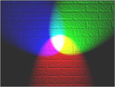
Suppose two colors are maxed out.  (255,255,0) is equally red and green; if you’re familiar with color addition, you know this is yellow.  Similarly, (255,0,255) is magenta, and (0,255,255) is cyan.  So far, so good.

Now suppose one color is maxed, and another is at half value.  Here’s where things get interesting.  Consider (255,128,0), which is (in a sense) halfway between red (255,0,0) and yellow (255,255,0).  Not surprisingly, (255,128,0) is called orange.  But what about halfway between yellow and green, i.e. the color (128,255,0)?  Mathematically, this should be as unique a color as orange, but (sorry) it just looks like a different shade of green to me.  Why is that?  What’s special about (255,128,0), but not about (128,255,0)?

It turns out that (128,255,0) has a name: chartreuse.  But probably only one person out of twenty could identify chartreuse out of a line-up.

If you want to experiment, try the other “halfsies” using this RGB applet.  The combinations you should test are

(255,128,0) = ORANGE

(128,255,0) = CHARTREUSE

(0,255,128) = ?

(0,128,255) = ?

(128,0,255) = ?

(255,0,128) = ?

Only one of these is obvious to me, i.e. the color (0,128,255) which is halfway between cyan and blue.  That’s the color of a clear sky, and is known in English as azure.

Do any of these combinations have unique names in other languages?

Here’s a modern-day color wheel (thanks, Wikipedia!), which puts all of this into perspective:

colors

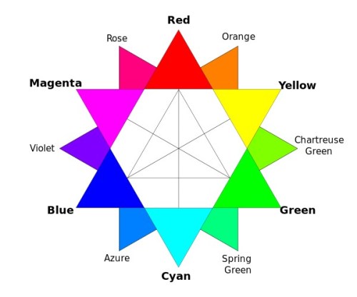
[Note that “violet” here isn’t really true violet (as in a rainbow), which cannot be represented on an RGB computer monitor.]

Are these the names you came up with?  Personally, I called (0,255,128) “dark mint green” instead of Spring Green, but what do I know.

And here we get to the psychology of color, which is the main point of this post.  Look at the trifecta of red/orange/yellow: most people would classify those as three really distinct colors.  Now look at the trifecta chartreuse green/green/spring green.  Those all just look like green, to me.  They aren’t as distinct.  And I think the reason is completely in my mind.

Think back to when you studied color in kindergarten.  The “primary” subtractive colors were red/yellow/blue.  [That’s now known to be bullshit, of course; there are no three canonical primary subtractive colors; we instead make a choice of three primaries based on what colors those three could possibly make upon mixing (this is called the gamut) and  cyan/yellow/magenta gives a better gamut than red/yellow/blue.  Put another way, if you only had three crayons, then choose cyan/yellow/magenta instead of red/yellow/blue because more mixed colors will be available to you.]  Anyway, now look at the RGB wheel and find red/yellow/blue.  They aren’t equidistant.  Something is wrong.

Here’s my thesis: I think that the red/yellow/blue bullshit we lived through at the age of 6 has biased us towards thinking that red and yellow are more different than they really are.  Look at the wheel again.  In terms of RGB numbers, red and yellow are as similar as blue and cyan.  Hard to believe, I know, but that’s the way the cookie crumbles.

One final thought: in English, in kindergarten, when you mix white with red, you get pink.  What about mixing white with green?  Or white with blue?  How come there aren’t unique names for those colors?

(255,200,200) = PINK

(200,255,200) = ?

(200,200,255) = ?

Advertisement

Read Full Post »

crayon

Very slightly more green than blue, “Tropical Rain Forest” can be thought of as a dark cyan.

My wife called me the other day and asked what my favorite color was.

“Hold on one second,” I said.  “I have it written down.”

She explained that she just needed a color in the most general terms, because she was buying me a case for my new iPhone.  So I said “blue.”  But I was disappointed that I didn’t get to be more specific.

You see, my actual favorite color is (currently) Tropical Rain Forest, formulated by Crayola in 1993.  Its RGB color code is (0, 117, 94).  If you want to read about the color, it’s the first variation on jungle green in the Wikipedia article of the same name.

But what’s an RGB color code?  Anyone familiar with computer graphics will recognize RGB as standing for Red/Green/Blue, which are taken to be the three primaries.  And therein lies a tale: for didn’t we all learn in kindergarten that red, blue, and yellow (not green) were the primary colors?  What’s going on?

Light comes in different wavelengths, or more commonly, combinations of multiple wavelengths.  Color is a purely biological phenomenon having to do with what we perceive with our eyes.  So when a kindergarten teacher says that “mixing red and blue make purple”, there’s really a whole lot of physics and biology that’s being glossed over.

In our retinas, we (generally) have three kinds of cones that react to incoming light.  These cones can detect many wavelengths of light, but each peaks in a different part of the spectrum.  Very simplistically, we can say that one peaks in the “red” part of the visible spectrum, one peaks in the “green” part of the spectrum, and one peaks in the “blue”.

Now, the “red” cones don’t just react to red light—it’s just that they react most strongly to red light.  But light in the “green” part of the spectrum might also stimulate a “red” cone to some degree.  The colors that we see depend on how our brains interpret three signals: how much each of the three kinds of cones is stimulated by incoming wavelengths of light.  For example, if a “red” cone and a “green” cone were stimulated about equally, your brain would interpret this as seeing yellow.  If all three cones were stimulated strongly, you’d “see” white.  (It’s weird to note that different combinations of wavelengths can actually cause the same sensation in your brain: there’s not necessarily a unique combination of wavelengths for any given color perceived.)

Here’s a chart to help you out (note that this is very simplistic and glosses over many issues which I will address later):

Kind(s) of cone stimulated            What you perceive

“Red”                                                                Red

“Green”                                                            Green

“Blue”                                                               Blue

Red & Green                                                    Yellow

Red & Blue                                                       Magenta

Green & Blue                                                   Cyan

Looking at this chart makes the notion of an “additive” primary easy to understand.  We declare red, green, and blue (RGB) to be the additive primary colors.  We can then build (most) other colors by adding these colors together.  This corresponds to multiple wavelengths of light stimulating one or more cones in the retina to varying degrees.  If you want an applet to play around with this kind of additive color mixing, try this.  Input (0, 117, 94) if you want to see Tropical Rain Forest.

colors

Additive color mixing

One caveat: the RGB scheme arbitrarily chooses three exact wavelengths of light to be “the” additive primaries, but this represents a judgment call on our part.  The degree to which different wavelengths of light stimulate the three kinds of cones is messy; the graphs of intensity (of cone response) vs. wavelength are not perfect bell curves, and have bumps and ridges.  Furthermore, it has long been known that if you try to limit yourself to only three “primary” additive colors then you cannot reproduce every possible color that humans can perceive.  We would say that the gamut of possible colors you can make with an RGB scheme does not encompass all possible perceived colors.  (For example, true violet as seen in the rainbow cannot be reproduced with RGB—it can only be approximated.  You can’t see true violet on a computer monitor!)

Now, tell a 6-year-old that Red + Green = Yellow, and they will look at you like you’ve grown a second head.  That’s because most experience we have with “color mixing” doesn’t involve mixing different kinds of light; it involves mixing different kinds of pigments.  And that’s a totally different ball of (crayon?) wax.

Suppose I have a flashlight that shines red light.  I have another flashlight that shines green light.  If I shine both flashlights into your eyes, you will see yellow, as we just discussed.  With two flashlights (two colors), more light has reached your eyes than would have with just one flashlight.

Pigments (such as crayons or paint) work in the opposite way.  “Red” paint is paint that takes white light (a combination of R,G, and B) and subtracts some of the light away, so that only the R reaches your eyes.  Green paint takes RGB light and lets only the G reach your eyes.  In other words, red paint “blocks” G and B, whereas green paint “blocks” R and B.

Can you guess what happens if we mix red and green paint?

The 6-year-old knows you get black.  That’s because two successive blockers have filtered out all the light, and nothing reaches your eyes at all.  And when no cones are stimulated, we perceive that as black.

When a teacher says that the “primary” colors are red, blue, and yellow, they are referring to so-called subtractive primaries.  By mixing those three kinds of pigments, you can make many of the colors we can see.  But not all the colors.  Try mixing red, blue, and yellow to make pink.  It cannot be done.  Like the additive primaries, the gamut of the subtractive primaries is limited.  And, like the choice of RGB as additive primaries, the choice of red, blue, and yellow as the subtractive primaries is arbitrary.  Arbitrary, and inferior.  It turns out that using yellow, magenta, and cyan as the subtractive primaries expands the gamut and increases the number of colors you can make by subtraction.

Why yellow, magenta, and cyan?  Well, those choices make sense if you’ve already picked RGB as your additive primaries.  Consider the chart above.  It’s clear that a paint that looks magenta must be blocking green, since you’re seeing an (additive) combination of red and blue.  Similarly, yellow paint blocks blue, and cyan paint blocks red.  So what happens if we mix, say, yellow and cyan?  Well, the mixture will block blue, and then block red, so what is left is green.  You can try this here.

Anyway, I spent some time at this site trying to determine exactly my favorite color.  I finally chose Tropical Rain Forest, RGB=(0, 117, 94).  I think it’s peaceful and organic.  I also enjoy Tyrian purple, RGB = (102, 2, 60).  Let me know which colors you favor.

Coming soon: some thoughts about the extra-spectral colors!

Read Full Post »