I continue to be fascinated by the RGB color scheme, and extra-spectral colors in particular. And the NFL football season starts tonight. And so I ponder: are there any patterns/trends in the official team colors of the 32 NFL teams? Well, I’m glad you asked.
First of all, here are the “official” colors of the teams with their exact RGB ratings. You will notice that there are a few teams that, perversely, have more than two team colors.
| Locale | Team name | Color | R | G | B |
| Arizona | Cardinals | gold | 255 | 182 | 18 |
| Arizona | Cardinals | red | 151 | 35 | 63 |
| Atlanta | Falcons | red | 167 | 25 | 48 |
| Atlanta | Falcons | silver | 165 | 172 | 175 |
| Baltimore | Ravens | gold | 158 | 124 | 12 |
| Baltimore | Ravens | red | 198 | 12 | 14 |
| Baltimore | Ravens | purple | 26 | 25 | 95 |
| Buffalo | Bills | red | 198 | 12 | 48 |
| Buffalo | Bills | blue | 0 | 51 | 141 |
| Carolina | Panthers | silver | 191 | 192 | 191 |
| Carolina | Panthers | blue | 0 | 133 | 202 |
| Chicago | Bears | orange | 200 | 56 | 3 |
| Chicago | Bears | navy | 11 | 22 | 42 |
| Cincinnati | Bengals | black | 0 | 0 | 0 |
| Cincinnati | Bengals | orange | 251 | 79 | 20 |
| Cleveland | Browns | brown | 49 | 29 | 0 |
| Cleveland | Browns | orange | 255 | 60 | 0 |
| Dallas | Cowboys | navy | 0 | 34 | 68 |
| Dallas | Cowboys | blue | 0 | 53 | 148 |
| Dallas | Cowboys | silver | 134 | 147 | 151 |
| Denver | Broncos | orange | 251 | 79 | 20 |
| Denver | Broncos | navy | 0 | 34 | 68 |
| Detroit | Lions | blue | 0 | 118 | 182 |
| Detroit | Lions | silver | 176 | 183 | 188 |
| Green Bay | Packers | gold | 255 | 184 | 28 |
| Green Bay | Packers | green | 24 | 48 | 40 |
| Houston | Texans | blue | 3 | 32 | 47 |
| Houston | Texans | red | 167 | 25 | 48 |
| Indianapolis | Colts | blue | 0 | 44 | 95 |
| Indianapolis | Colts | gray | 162 | 170 | 173 |
| Jacksonville | Jaguars | gold | 215 | 162 | 42 |
| Jacksonville | Jaguars | dark gold | 159 | 121 | 44 |
| Jacksonville | Jaguars | teal | 0 | 103 | 120 |
| Kansas City | Chiefs | gold | 255 | 184 | 28 |
| Kansas City | Chiefs | red | 227 | 24 | 55 |
| Las Vegas | Raiders | black | 0 | 0 | 0 |
| Las Vegas | Raiders | silver | 165 | 172 | 175 |
| Los Angeles | Rams | yellow | 255 | 209 | 0 |
| Los Angeles | Chargers | gold | 255 | 194 | 14 |
| Los Angeles | Rams | blue | 0 | 53 | 148 |
| Los Angeles | Chargers | blue | 0 | 128 | 198 |
| Miami | Dolphins | orange | 252 | 76 | 2 |
| Miami | Dolphins | aqua | 0 | 142 | 151 |
| Minnesota | Vikings | gold | 255 | 198 | 47 |
| Minnesota | Vikings | purple | 79 | 38 | 131 |
| New England | Patriots | red | 198 | 12 | 48 |
| New England | Patriots | navy | 0 | 34 | 68 |
| New England | Patriots | silver | 176 | 183 | 188 |
| New Orleans | Saints | black | 16 | 24 | 31 |
| New Orleans | Saints | gold | 211 | 188 | 141 |
| New York | Giants | red | 163 | 13 | 45 |
| New York | Jets | green | 18 | 87 | 64 |
| New York | Giants | blue | 1 | 35 | 82 |
| New York | Giants | gray | 155 | 161 | 162 |
| New York | Jets | white | 255 | 255 | 255 |
| Philadelphia | Eagles | green | 0 | 76 | 84 |
| Philadelphia | Eagles | silver | 165 | 172 | 175 |
| Pittsburgh | Steelers | gold | 255 | 182 | 18 |
| Pittsburgh | Steelers | black | 16 | 24 | 32 |
| San Fran. | 49’ers | red | 170 | 0 | 0 |
| San Fran. | 49’ers | gold | 173 | 153 | 93 |
| Seattle | Seahawks | green | 105 | 190 | 40 |
| Seattle | Seahawks | navy | 0 | 34 | 68 |
| Seattle | Seahawks | silver | 165 | 172 | 175 |
| Tampa Bay | Buccaneers | orange | 255 | 121 | 0 |
| Tampa Bay | Buccaneers | red | 213 | 10 | 10 |
| Tennessee | Titans | red | 200 | 16 | 46 |
| Tennessee | Titans | navy | 12 | 35 | 64 |
| Tennessee | Titans | blue | 75 | 146 | 219 |
| Washington | Ftbl. team | burgundy | 63 | 16 | 16 |
| Washington | Ftbl. team | gold | 255 | 182 | 18 |
I’ve already had to make a few judgement calls. For example, most teams have three team colors: two typical colors, and then either white or black. In most cases I’ve thrown white or black out, unless they are one of the two main colors (in my opinion). For instance, the Cincinnati Bengals are orange and black. I’ve only held onto three colors if I feel they are crucial to their color scheme. The Dallas Cowboys are particularly meretricious in this regard. They claim no less than five colors: white, blue, navy blue, royal blue, and silver. Based on my own aesthetic color sense I have pared this down to three.
Also note that I have renamed the colors in most cases. Many of the teams copy one another, using the exact same colors, but call those colors by different names. The most egregious example is the color (0,34,68) which is used by four different teams. Dallas calls this blue, Denver calls it Broncos navy, New England calls it nautical blue, and Seattle calls it college navy. I just call it blue.
Only one team has a “pure” RGB color: the San Francisco 49’ers have red (170,0,0). You gotta give ‘em props for going all-in on red. I guess (255,0,0) was too “bright” so they darkened it a little, but hey.
So, is there a way to visualize this data in a graph? The problem is displaying 3-tuples in two dimensions. Luckily, there is a way to do this. It’s called a chromaticity graph. Define three new variables thus:
r = R/(R+G+B)
g = G/(R+G+B)
b = B/(R+G+B)
You can think of these variables as indicating the relative percentage of each core color, without regard to brightness. So magenta (255,0,255) has values r = 0.5, g=0, b = 0.5, indicating that magenta is half red, half blue. Similarly, chartreuse (128,255,0) has values r = 0.333, g=0.666, b = 0, indicating that it is 1/3 red and 2/3 green.
Now consider plotting r vs. g. You might think you’ve “lost” information about the value of b, but that is not the case. Since r + g + b = 1 is necessarily true, you could always recreate the value of b if you needed it.
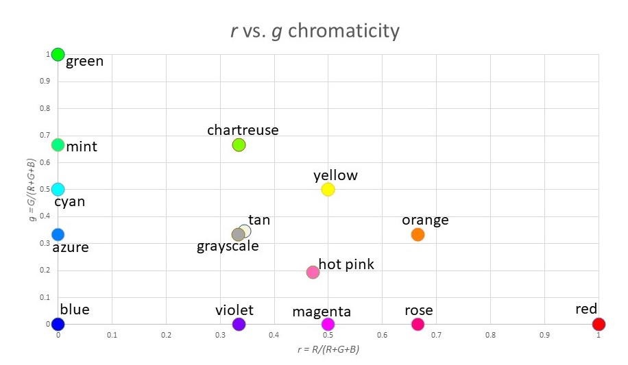
Here is a plot of r vs. g, which is a chromaticity graph:

Where you have lost information is in the value of “brightness”. For example, white (255,255,255), gray (128,128,128) and black (0,0,0) are all plotted at the exact same coordinate (r,g) = (0.333,0.333). And blue (0,0,255) and dark blue (0,0,128) look very different, but again they map to the same point (r,g) = (0,0).
Note that most of the “standard” colors we have names for appear on the outer edge of the triangle (since one of the three variables R,G,B is zero). The exceptions are the grayscale colors (white, gray, black) which are at the center of mass of the triangle, and other extra-spectral colors like tan or hot pink.
Speaking of extra-spectral colors: there are two main ways to “construct” them. You can either:
- mix all three colors R,G,B in roughly equal measure, or
- mix R and B with very little G.
With this in mind, we see that the extra-spectrals occupy the middle portion of the triangle, as well as the bottom edge:

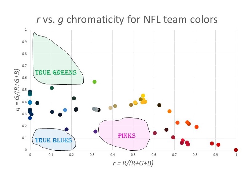
OK, so back to my original goal…visualizing the NFL team colors. Here is a chromaticity plot of all the team colors in the above table:

What trends do you notice?
- There are plenty of reds, of all varieties.
- All the blues have a major element of green as well. That is, there is a cluster of colors around azure and cyan, but no true blues. The blue with the least green is Buffalo Bills blue, at g = 27%.
- There are no true greens. In fact, there are few greens at all. The maximum green is g = 57% for the Seattle Seahawks.
- There are no pinks: nothing anywhere close to magenta.
- There is almost a “main sequence” like in an H-R diagram, running from cyan to gray to yellow. Why do so many NFL colors have g ≈ 33%?
- There is a huge cluster of colors around “gold”.
I’m sure you can find other patterns. Here is a map of the “under utilized” colors for NFL teams:

The pink/magenta thing makes sense. For some reason, people think these are not masculine colors. (This was not always the case. Pink used to be associated with boys.) But what about the lack of green? And the lack of true blue without green? I have no idea. Maybe someone can enlighten me.
