Imagine that there’s an ice cream truck parked near a school. It’s 3pm; class is dismissed and a steady stream of kids approach the truck. For simplicity, let’s stipulate the following rules:
1. If a kid has enough money, he or she will buy an ice cream cone;
2. A kid will only buy one ice cream cone;
3. A kid will buy the most expensive ice cream cone he or she can.
After the kids buy ice cream (or not) they continue on their way, having whatever leftover money they might have in their pocket.
My question is this: by seeing how much money kids have left, what can you determine about the prices of ice cream cones? (Astute observers will note that this toy model has many similarities to the Franck-Hertz experiment of 1914, but we’re not there yet.)
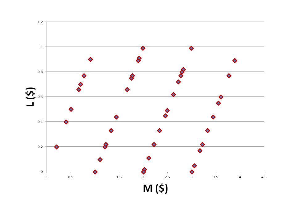
Let’s look first at some hypothetical data. Here we have plotted L (money left over in a kid’s pocket) as a function of M (how much money a kid started with) for a school with 11 kids:

There doesn’t seem to be a pattern. Maybe we don’t have enough data? Let’s increase the number of kids to 42:
The sawtooth form of the function is characteristic of problems of this type, and can be understood intuitively. First of all, notice that the function is linear to begin with, with a slope of exactly one; this means that below a certain threshold value of M, a kid can’t afford any ice cream, so he/she ends up with the same amount of money he/she started with. Eventually, if M ≥ $1, a kid can buy a cone; L then plummets because the kid has spent a dollar.
It seems obvious from the graph, then, that ice cream cones are priced at $1, $2, and $3; beyond that we don’t have any data so can’t draw more conclusions.
Now, if we relax the stipulation that kids only buy one cone, then our data is ambiguous. Maybe the cones are priced $1/$2/$3, or maybe cones are always just $1, and kids are buying more than one cone if they can. We can’t distinguish between these cases; that’s why I put the original stipulation there to begin with.
Let’s try a more challenging graph:
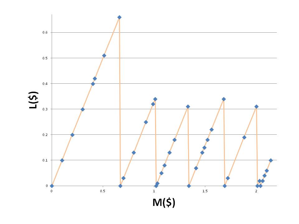
This graph is much harder to interpret. The first peak is much bigger than the others; there is also a very tiny peak on the right-hand side. It helps if you know where the jumps are: L jumps down to zero whenever M is equal to $0.67, $1.02, $1.34, $1.69, $2.01, and $2.04. If you want to work out the ice cream cone prices for yourself, feel free. I’ll wait.
The solution? A little trial and error will give you two different prices for ice cream cones: A= $0.67 and B=$1.02. Then the jumps occur at A, B, 2A, A+B, 3A, and 2B. If we were doing physics, we’d make a prediction: we would expect the next jump to occur at $2.36, which is B+2A. Observing this would support our hypothesis. But if the next jump occurred at $2.22, say, then we’d have to revise our theory and posit a new ice cream C priced at $2.22.
What does any of this have to do with physics?
I use this example when I introduce the Franck-Hertz experiment to my students. This experiment was first performed in 1914 (an auspicious year!) and provided support for Bohr’s idea that atoms have specific (quantized) energy levels. Electrons are accelerated and shot towards mercury atoms (in a vapor). The electrons may then give energy to the atoms (exciting them) or they may not, bouncing off without loss of kinetic energy. We look at how much energy the electrons have to start with, and how much they end up with, and thereby deduce the energy levels of the mercury atoms.
How is that possible? In terms of the analogy, make the following transformations:
kids –> electrons
ice cream truck –> Hg atoms
kids buying ice cream at certain prices –> electrons giving certain amount of energy to Hg atoms
prices of ice cream cones –> energy levels of Hg
M (initial amount of money) –> V (proportional to initial kinetic energy of electron)
L (leftover money) –> I (proportional to final kinetic energy of electron)
If energy levels of an atom are truly quantized, then we would expect a graph of I vs. V to look like our graphs above, with an increasing sawtooth pattern. Where the drops occur will then tell us the specific energy levels of the Hg atom. (Incidentally, why do we use V and I? Well, in the actual experiment the easiest way to measure initial kinetic energy is by measuring the voltage used to accelerate the electrons; the easiest way to measure final kinetic energy is to measure the current of the electrons after they have passed through the Hg vapor.)
How did the experiment go? Here are the results:

It should be obvious that atomic energy levels have specific “prices”, and that there’s a minimum amount of energy that an electron must have in order to “buy” an atomic transition (exciting the atom at the expense of the electron’s kinetic energy). It remains for the experimenter to do some elementary unit conversions, to translate I and V into final and initial kinetic energy.
[Note for advanced students and/or physicists: it is interesting to ponder the following questions, which highlight the fact that the ice cream analogy is not perfect: (1) why is the I vs.V graph not linear at low voltage? (2) After “spending” kinetic energy to cause the first excited state, why does the electron’s energy not drop all the way down to zero?]
