Feeds:
Posts
Comments

Up until Oct. 7, 2013, my modest blog averaged about 18 hits per day.  Then this happened:

VIRAL

A post of mine, the 9 kinds of physics seminar, had gone viral.  I was shocked, to the say the least.

I spent some time investigating what happened.  The original post went out on a Thursday, Oct. 3.  Nothing much happened, other than a few likes from the usual suspects (thank you, John Zande!)  I did share the post with Facebook friends, which include not a few physicists.  (Note: I don’t normally share my blog posts to Facebook.)  Then on Monday, Oct. 7, the roof caved in.

It started in India.  Monday morning, I had over 800 hits from India.  My initial thought was that I was bugged somehow.  But soon, hits started pouring in from around the world, especially the USA.

And then it kept going.

On Tuesday, Oct. 8, the Physics Today Facebook page shared the post, where (as of today) 451 more people have shared it, and 188,000 people have liked it.  (Interesting question: my blog has only had 130,000 views.  Are there really that many people who like Facebook posts without even clicking on the link?)

The viral spike peaked on Wed., Oct. 9.  I had discovered by then that my post had been re-blogged and re-tweeted numerous times, by other physicists around the world.  If you Google “The 9 kinds of physics seminar” you can see some of the tweets for yourself.

Why did the post go viral?  Who knows.  I’m not a sociologist.  I think it was a good post, but that’s not the whole story.  More importantly, the post was funny, and it resonated with a certain segment of the population.  If I knew how to make another post go viral, I’d do so, and soon be a millionaire.

What’s fascinating to me, though, as a math nerd, is to examine how the virality played out mathematically.  Here’s how it looked for October:

Chart 1

I don’t know anything, really, about viral cyberspace, but this graph totally matches my intuition.  Note that for the last few days, the hits have been around 400/day, still much greater than the pre-viral era.

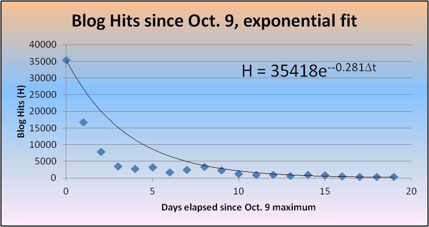
After the spike, is the decay exponential?  I’m not a statistician (maybe Nate Silver could help me out?) but I do know how to use Excel.  Hence:

Chart 2

The decay constant is 0.495, corresponding to a half-life of 1.4 days.  So after the peak, the number of hits/day was reduced by 1/2 every 1.4 days.

This trend didn’t continue, however.  Let’s extend the graph to include most of October:

Chart 3

Over this longer time span, the decay constant of 0.281 corresponds to a half-life of 2.5 days.  The half-life is increasing with time.  You can see this by noticing that the first week’s data points fall below the exponential fit line.  It’s as if you have a radioactive material with a half-life that increases; the radioactive decay rate goes down with time, but the rate at which the number of decays decreases is slowing down.  (Calculus teachers: cue discussion about first vs. second derivatives.)

Maybe this graph will help:

Chart 4

The long-term decay rate seems to be 0.1937, corresponding to a half-life of 3.6 days.  At this rate, you would expect the blog hits to approach pre-viral levels by mid-November.  I doubt that will happen, since the whole experience generated quite a few new blog followers; but in any case, the graph should level off quite soon.  What the new plateau level will be, I don’t know.

Where’s Nate Silver when you need him?

**********************************************************************************

If you enjoyed this post, you may also enjoy my book Why Is There Anything? which is available for the Kindle on Amazon.com.

sargasso

I am also currently collaborating on a multi-volume novel of speculative hard science fiction and futuristic deep-space horror called Sargasso Nova.  Publication of the first installment will be January 2015; further details will be released on Facebook, Twitter, or via email: SargassoNova (at) gmail.com.

Why many worlds?

I thought I would re-post this excellent discussion of the many-worlds interpretation by David Yerle:

Why I Believe in the Many-Worlds Interpretation

I agree with him 100%, and he says it better than I ever could.  The crux of the argument is this: it depends on the book you’re reading, but as a practical matter there are typically 4 postulates of quantum mechanics (about the primacy of the wavefunction, Schrödinger’s equation, measurements being Hermitian operators, and wave function collapse).  Many worlds is what you get when you reject the unmotivated “wave function collapse” postulate.  It is a simpler theory in terms of axioms, so obeys Occam’s razor.  If multiple universes bother you, think of how much it bothered people in the 1600’s to contemplate multiple suns (much less multiple galaxies!)

Wvf_Anti-Bond

Last week I had a post go viral.  My hits went into the stratosphere, and traffic to my blog went up by a factor of almost 1,000.  I know this is my 15 minutes, and they’re fading fast.  So, while I still have some elevated traffic, I thought I’d re-blog a few older posts, to see what happens.

Number form synesthesia or: why is there a kink at 20?

Whenever I think of numbers, I form a mental image in my head.  This is not a conscious process; it happens consistently and involuntarily.  For example, whenever I imagine the numbers 1 through 100, I see something like this:

Numbers

You will note several interesting features of this mental map.  Firstly, there is always a 90° left turn at the number 20; there is always a 90° right turn at the number 100.  These two kinks are the only kinks in my mental number line; the lines are perfectly straight before zero and after 100.  Why the kinks are there is mysterious.

Notice also that the image is not to scale.  That is, 50 occurs half-way between 20 and 100 (why isn’t 60 there instead?)

Here’s another mental map I have, one that appears whenever I imagine a person’s age:

Age

You will note that this mental image is similar to the previous one, but rotated 90° to the right.  The scale is also warped: not only in the location of 50 yrs., but in the location of 10 yrs.  I believe this stems from my childhood belief that the years from age 10 to age 20 would seem to last longer than the years from 0 to 10.

Why childhood?  Well, I’ve had such mental images for as long as I can remember; it follows that they were first “constructed” in my brain at an early age.  And there is a sort of logic to the idea that 10-20 lasts “longer” than 0-10.  After all, we don’t normally recall anything about our first 5 years or so; to a child, it’s almost as if you missed those years.  So if I am 10 years old, say, and looking back at my life so far, it won’t seem nearly as long as the decade looming in front of me.  (I must stress that I am not a neuroscientist and that this is all pure speculation.)  As for why 50 is half-way between 20 and 100, I can only conclude that I wasn’t so good at calculating averages when I was younger.  The similarity of the two mental maps is best explained by positing that one of the maps is derived from the other, although which came first I cannot say.

But still, that kink…

I only became aware very, very recently that there is a name for this phenomenon.  These maps I make are called “number forms” and they are a form of synesthesia.  I have a friend who experiences grapheme-color synesthesia, seeing letters and numbers as if they had very specific colors.  It never occurred to me that my mental number maps were a related phenomenon in any way.

Here’s how I see the months of the year:

Calender

The order is always counterclockwise.  Strangely, the months are not quite evenly distributed: July is always at the top, but December/January are level at the bottom, with the (strange) consequence that there is one more month in the first “half” of the year than the second.  I also mentally divide the year into three partitions, starting at Sept. 1, Jan. 1, and June 1.  I am confident that this partitioning is a product of having attended school (on a semester system) for 25 years of my life.

Here’s the strangest map of all, but one that has (I think) the easiest explanation:

Years

This is how I picture the recent history of the world, from the late 1700’s to the present.  There are four kinks: at 1800, 1900, 1950, and 2000.  The three biggest wars (to an American, at least) are marked in red; 1968 is also clearly “labeled” in my mental map (obviously because it’s the year of my birth).  Again, there is a lack of scale: 1800-1900 takes up as much “space” as 1900-1950.  One might conclude that I regard the 20th century as more “important” than the 19th, since I relegate more space to the former.  But there is a simpler explanation.

I can still vividly recall a timeline of history that I saw, perhaps in the 3rd or 4th grade, that has the exact same topology as this last mental map of mine.  The years from 1800 to 1970 (or so) were graphically depicted in a timeline; there were folds at 1900 and 1950, simply to make the timeline fit on the printed page.  Above key years (such as 1939) were cartoonish drawings of world events, such as World War II or Man Lands on the Moon.  Beyond the 1970’s there was nothing.  I wish I could find this image, which I believe in some sense “triggered” this form of synesthesia; I want to say that the image was in a World Book Encyclopedia but I have no proof of this claim.

In any case, I think other forms of synesthesia may also be linked to the way we first learn certain things.  My friend (who sees colors for every letter of the alphabet) once told me the probable origin of his synesthesia.  He first learned letters and numbers through colored refrigerator magnets; the colors and letters became inextricably tied in his mind, and the connections exist to this day.  For any real neuroscientists out there, I believe this is a fruitful area for further research.

Anyway, I’d be curious to see how many other people experience “number forms”.  It doesn’t make you crazy.  After all, Sir Francis Galton called his book on the subject The Visions of Sane Persons.

But still, that kink…

Last week I had a post go viral.  My hits went into the stratosphere, and traffic to my blog went up by a factor of almost 1,000.  I know this is my 15 minutes, and they’re fading fast.  So, while I still have some elevated traffic, I thought I’d re-blog a few older posts, to see what happens.

Don’t Supersize Me:  A modest proposal.

This post first appeared on Nov. 9, 2012.

What if there were a way to increase donations to worthy causes, while at the same time help fight this country’s obesity problem?

I think there is a way, and it would be simple to test.  Suppose fast food restaurants that offer “meal deals” (burger + drink + one side, say) offered a $1 donation to Oxfam (or any other charity) as one of the side dish options?

oxfam

There are two obvious benefits.  One, I believe that people donate to charities more if they can do so conveniently.  I myself had never given money personally to a hungry family, but when a local grocery store asks me if I want to buy a box of food “for the children” I do so almost automatically.  Convenience allows us to then feel good about ourselves.

Secondly, people who choose this “side dish” are clearly missing out on calories that most don’t need anyway.  How often do people get french fries, even when they don’t want them, just because they “came with the meal”?  And subsequently, how many people eat the fries, because they paid for them–-even if they are no longer hungry?  I’ve done this myself, although it seems irrational in hindsight.

What if instead I order a $5 meal deal and the cashier asks, “What side?” and my response is, “give it to the hungry”, and the restaurant then has some automatic money transfer mechanism in place to make the donation in an instant?  I don’t know which would do society more good: the money raised, or the calories not consumed.  Why isn’t this a win/win?  Or a win/win/win, since the restaurant doesn’t lose anything, and only gains the positive PR?  It would even show evidence that the restaurant has heard the message of “Supersize Me” and taken it to heart.

I think this idea is a good one, and I hope someone reads this post and shares the idea.  All it would take would be one restaurant to start doing this, and before long all of them would be doing it.  I can’t see a single downside at all.

Admittedly, this may have been tried before.  If so: I wonder why it hasn’t caught on?  What are the economics of such institutionalized charity?  I think there are other interesting questions at play here…does charity in fact increase when it is convenient to give?  (I’d love to see the research data on this.)  Would people forgo empty calories in such a scenario?  What would be the economic benefit of millions of calories not being consumed?  Might there even be an adverse effect for, say, the potato industry, if less fries are scarfed down?

Let me know what you think.  And please share this if you think that someone, somewhere, will see it and have the possibility of implementing it.

[Note: this blog post, first posted on Nov. 9, 2012,  was originally written on Dec. 15, 2010, and emailed to a celebrity who will remain nameless.  Needless to say, there was never a response…not even an automated one.]

In my continuing effort to present cutting-edge research, I present here my findings on the 9 kinds of physics undergrad.

First, let’s look at a scatter plot of Ability vs. Effort for a little more than 100 students.  (This data was taken over a span of five years at a major university which will remain unnamed.  Even though it’s Wake Forest University.)

HR diagram

Student ability is normalized so that 1 is equivalent to the 100th percentile, 0 is the 50th percentile, and –1 is the 0th percentile.  [This matches the work of I. Emlion and A. Prilfül, 2007]  Ability scores below –0.5 are not shown (such students more properly belong on the Business Major H-R diagram).

On the x-axis is student effort, given as a spectral effort class [this follows B. Ess, 2010]:

O-class: Obscene

B-class: Beyond awful

A-class: Awful

F-class: Faulty

G-class: Good

K-class: Killer

M-class: Maximal

As you can see, most students fall onto the Main Sequence.

HR typical

The Typical student (effort class G, 50th percentile) has a good amount of effort, and is about average in ability.  They will graduate with a physics degree and eventually end up in sales or marketing with a tech firm somewhere in California.

HR giant

The Giant student (effort class K, 75th percentile) has a killer amount of effort and is above average in ability.  Expect them to switch to engineering for graduate school.

HR smug

The Smug Know-it-all student (effort class O, 100th percentile) is of genius-level intellect but puts forth an obscenely small amount of effort.  They will either win the Nobel prize or end up homeless in Corpus Christi.

HR grad

The Headed to grad school student (effort class B, 75th percentile) is beyond awful when it comes to work, and spends most of his/her time playing MMORPG’s.  However, they score well on GRE’s and typically go to physics graduate schools, where to survive they will travel to the right (off the main sequence).

HR industry

The Headed to industry student (effort class F, 55th percentile) is slightly above average but has a faulty work ethic.  This will change once they start putting in 60-hour weeks at that job in Durham, NC.

HR phobe

The Hard working math-phobe student (effort class M, 30th percentile) is earnest in their desire to do well in physics.  However, their math skills are sub-par.  For example, they say “derivatize” instead of “take the derivative”.  Destination: a local school board near you.

HR super

The Supergiant student (effort class K, 100th percentile) is only rumored to exist.  I think she now teaches at MIT.

HR frat

The Frat boy student (effort class O, 50th percentile) is about average, but skips almost every class.  Their half-life as a physics student is less than one semester.  They will eventually make three times the salary that you do.

HR dwarf

The White dwarf student (effort class B, 30th percentile) is below average in ability and beyond awful when it comes to putting forth even a modicum of effort.  Why they don’t switch to being another major is anyone’s guess.

***********************************************************************************

If you enjoyed this post, you may also enjoy my book Why Is There Anything? which is available for the Kindle on Amazon.com.  The book is weighty and philosophical, but my sense of humor is still there!

***********************************************************************************

sargasso

I am also currently collaborating on a multi-volume novel of speculative hard science fiction and futuristic deep-space horror called Sargasso Nova.  My partner in this project is Craig Varian – an incredibly talented visual artist (panthan.com) and musician whose dark ambient / experimental musical project 400 Lonely Things released Tonight of the Living Dead to modest critical acclaim a few years back.  Publication of the first installment will be January 2015; further details will be released on our Facebook page, Twitter feed, or via email: SargassoNova (at) gmail.com.

As a public service, I hereby present my findings on physics seminars in convenient graph form.  In each case, you will see the Understanding of an Audience Member (assumed to be a run-of-the-mill PhD physicist) graphed as a function of Time Elapsed during the seminar.  All talks are normalized to be of length 1 hour, although this might not be the case in reality.

Typical

The “Typical” starts innocently enough: there are a few slides introducing the topic, and the speaker will talk clearly and generally about a field of physics you’re not really familiar with.  Somewhere around the 15 minute mark, though, the wheels will come off the bus.  Without you realizing it, the speaker will have crossed an invisible threshold and you will lose the thread entirely.  Your understanding by the end of the talk will rarely ever recover past 10%.

Ideal

The “Ideal” is what physicists strive for in a seminar talk.  You have to start off easy, and only gradually ramp up the difficulty level.  Never let any PhD in the audience fall below 50%.  You do want their understanding to fall below 100%, though, since that makes you look smarter and justifies the work you’ve done.  It’s always good to end with a few easy slides, bringing the audience up to 80%, say, since this tricks the audience into thinking they’ve learned something.

Theorist

The “Unprepared Theorist” is a talk to avoid if you can.  The theorist starts on slide 1 with a mass of jumbled equations, and the audience never climbs over 10% the entire time.  There may very well be another theorist who understands the whole talk, but interestingly their understanding never climbs above 10% either because they’re not paying attention to the speaker’s mumbling.

Experimentalist

The “Unprepared Experimentalist” is only superficially better.  Baseline understanding is often a little higher (because it’s experimental physics) but still rarely exceeds 25%.  Also, the standard deviation is much higher, and so (unlike the theorist) the experimentalist will quite often take you into 0% territory.  The flip side is that there is often a slide or two that make perfect sense, such as “Here’s a picture of our laboratory facilities in Tennessee.”

Undergrad

You have to root for undergraduates who are willing to give a seminar in front of the faculty and grad student sharks.  That’s why the “Well-meaning Undergrad” isn’t a bad talk to attend.  Because the material is so easy, a PhD physicist in the audience will stay near 100% for most of the talk.  However, there is most always a 10-20 minute stretch in the middle somewhere when the poor undergrad is in over his/her head.  For example, their adviser may have told them to “briefly discuss renormalization group theory as it applies to your project” and gosh darn it, they try.  This is a typical case of what Gary Larson referred to as “physics floundering”.  In any case, if they’re a good student (and they usually are) they will press on and regain the thread before the end.

Guest

The “Guest From Another Department” is an unusual talk.  Let’s say a mathematician from one building over decides to talk to the physics department about manifold theory.  Invariably, an audience member will gradually lose understanding and, before reaching 0%, will start to daydream or doodle.  Technically, the understanding variable U has entered the complex plane.  Most of the time, the imaginary part of U goes back to zero right before the end and the guest speaker ends on a high note.

Nobel

The “Nobel Prize Winner” is a talk to attend only for name-dropping purposes.  For example, you might want to be able to say (as I do) that “I saw Hans Bethe give a talk a year before he died.”  The talk itself is mostly forgettable; it starts off well but approaches 0% almost linearly.  By the end you’ll wonder why you didn’t just go to the Aquarium instead.

Poetry

The “Poetry” physics seminar is a rare beast.  Only Feynman is known to have given such talks regularly.  The talks starts off confusingly, and you may only understand 10% of what is being said, but gradually the light will come on in your head and you’ll “get it” more and more.  By the end, you’ll understand everything, and you’ll get the sense that the speaker has solved a difficult Sudoku problem before your eyes.  Good poetry often works this way; hence the name.

Politician

The less said about “The Politician”, the better.  The hallmark of such a talk is that the relationship between understanding and time isn’t even a function.  After the talk, no one will even agree about what the talk was about, or how good the talk was.  Administrators specialize in this.

If you enjoyed this post, you may also enjoy my book Why Is There Anything? which is available for the Kindle on Amazon.com.  The book is weighty and philosophical, but my sense of humor is still there!

sargasso

I am also currently collaborating on a multi-volume novel of speculative hard science fiction and futuristic deep-space horror called Sargasso Nova.  My partner in this project is Craig Varian – an incredibly talented visual artist (panthan.com) and musician whose dark ambient / experimental musical project 400 Lonely Things released Tonight of the Living Dead to modest critical acclaim a few years back.  Publication of the first installment will be January 2015; further details will be released on our Facebook page, Twitter feed, or via email: SargassoNova (at) gmail.com.

Move over, McDonalds!  There’s a new worst slogan in the world.

Budweiser (a “beer” company) has a new ad campaign about sports superstitions.  In a nutshell: sports superstitions (like sitting in your “lucky” chair) are funny, charming, and gosh darn it, might even be real!  Budweiser’s tagline: “It’s only weird if it doesn’t work”.

I disagree.  It’s weird, period.

What’s more, it’s ignorant, embarrassing, and frankly makes me a little pessimistic about humanity.  Do you really think that wearing that unwashed jersey will help your team win?  If yes, then please, please unfriend me on Facebook.  I don’t want to have anything to do with you.

aztecs40

This is only weird if it doesn’t work!

Superstitions have always been a force for evil in the world.  Yes, evil.  Superstitions caused Aztecs to pull the beating hearts out of innocent people.  Superstitions caused intelligent women to be burned at the stake as witches.  Superstitions caused Okonkwo to kill his son Ikemefuna to appease the village elders.  Superstitions put Galileo under house arrest, and drove Alan Turing to commit suicide, and prevent a sizeable number of otherwise educated adults from believing in the plain fact of man-made global warming.

Superstitions even keep a huge number of South Koreans from having fans in their bedrooms.

[Cue double-take]

I’m not making this up.  For some strange reason, many South Koreans think that a simple oscillating fan can kill you in your sleep.  This, despite the fact that fan death has never happened in human history.  And despite the fact that the rest of the entire world uses fans in their bedrooms to no ill effect.

Fan+Death

But wait! you might say, in Korean I presume.  People have been found dead with fans running nearby!  The fans must have killed them!  Case closed!

I’ll leave it to the reader to punch holes in that kind of “logic”.

You may have heard of the famous experiment in which B. F. Skinner discovered “superstition” in pigeons:

“Skinner placed a series of hungry pigeons in a cage attached to an automatic mechanism that delivered food to the pigeon ‘at regular intervals with no reference whatsoever to the bird’s behavior.’ He discovered that the pigeons associated the delivery of the food with whatever chance actions they had been performing as it was delivered, and that they subsequently continued to perform these same actions.” [http://en.wikipedia.org/wiki/B._F._Skinner#Superstitious_Pigeons]

pigeon

A typical Budweiser drinker.

Your team wins while you’re wearing that lucky shirt?  The shirt must have done it!  Of course, you should be ashamed of yourself.  You’re not any smarter than a pigeon.

Carl Sagan wrote a book called “The Demon Haunted World: Science as a Candle in the Dark”.  The idea is that science, and only science, illuminates; there is no other way to learn anything about the world.  The next time you’re around a “person” who exhibits superstitious nonsense around you, cough into your hand and say “Pigeon!”  Don’t worry; they won’t know what you’re talking about.  Like Giordano Bruno’s torturers, or the chicken-eater Wade Boggs, or the people who stoned Tessie Hutchinson, they have no idea what science is, or logic, or common sense.  They won’t have heard of B. F. Skinner or Carl Sagan or Alan Turing or Giordano Bruno.

They will, however, be familiar with Budweiser “beer”.

And they’ll be enjoying it, pathetically, in the dark.

Formula snobs

I am a formula snob.

We all know about grammar snobs: the ones who complain bitterly about people using who instead of whom.  Many people know how to use whom correctly; only grammar snobs care about it.  I gave up the whom fight long ago (let’s just let whom die) but I am a grammar snob when it comes to certain words.  For example, ‘til is not a word, as I have discussed before.

However, I am almost always a formula snob.

Consider this formula from the text I’m currently using in freshman physics:

x = v0 t + ½ a t2.

Beetlejuice-square

Robin Thicke, c. 2012

To me, looking at this equation is like watching Miley Cyrus twerk with Beetlejuice.  I would much, much rather the equation looked like this:

Δx = v0 Δt + ½ a Δt2.

The difference between these two formulas is profound.  To understand the difference, we need to talk about positions, clock readings, and intervals.

A position is just a number associated with some “distance” reference point.  We use the variable x to denote positions.  For example, I can place a meter stick in front of me, and an ant crawling in front of the meter stick can be at the position x=5 cm, x=17 cm, and so on.

A clock reading is just a number associated with some “time” reference point.  We use the variable t to denote clock readings.  For example, I can start my stopwatch, and events can happen at clock readings t=0 s, t=15 s, and so on.

Here’s the thing: physics doesn’t care about positions and clock readings.  Positions and clock readings are, basically, arbitrary.  A football run from the 10 yard line to the 15 yard line is a 5 yard run; going from the 25 to the 30 is also a 5 yard run.  The physics is the same…I’ve just shifted the coordinate axes.  If I watch a movie from 8pm to 10pm (say, a Matt Damon movie) then I’ve used up 2 hours; the same thing goes for a movie from 9:30pm to 11:30pm.  Because a position x and a clock reading t ultimately depend on a choice for coordinate axes, the actual values of x and t are of little (physical) importance.

Suppose someone asks me how far I can throw a football.  My reply is “I threw a football and it landed on the 40 yard line!”  That’s obviously not very helpful.  A single x value is about as useful as Kim Kardashian at a barn raising.

nebraska_amish_barn_raising

Can you pass that hammer, Kim?

Or suppose someone asks, “How long was that movie?” and my response is “it started at 8pm.”  Again, this doesn’t say much.  Physics, like honey badger, doesn’t care about clock readings.

Most physical problems require two positions, or two clock readings, to say anything useful about the world.  This is where the concept of interval comes in.  Let’s suppose we have a variable Ω.  This variable can stand for anything: space, time, energy, momentum, or the ratio of the number of bad Keanu Reeves movies to the number of good (in this last case, Ω is precisely 18.)  We define an interval this way:

ΔΩ = Ωf – Ωi

So defined, ΔΩ represents the change in quantity Ω.  It is the difference between two numbers.  So Δx = xf – xi is the displacement (how far an object has traveled) and Δt = tf – ti  is the duration (how long something takes to happen).

honey badger

Honey badger doesn’t care.

When evaluating how good a football rush was, you need to know where the player started and where he stopped.  You need two positions.  You need Δx.  Similarly, to evaluate how long a movie is, you need the starting and the stopping times.  You need two clock readings.  You need Δt.

I’ll say it again: most kinematics problems are concerned with Δx and Δt, not x and t.  So it’s natural for a physicist to prefer formulas in terms of intervals (Δx = v0 Δt + ½ a Δt2) instead of positions/clock readings (x = v0 t + ½ a t2).

But, you may ask, is the latter formula wrong?

Technically, no.  But the author of the textbook has made a choice of coordinate systems without telling the reader.  To see this, consider my (preferred) formula again:

Δx = v0 Δt + ½ a Δt2.

The formula says, in English, that if you want to calculate how far something travels Δx, you need to know the object’s initial speed v0, its acceleration a, and the duration of its travel Δt.

From the definition of an interval, this can be rewritten as

xf  – xi = v0 (t– ti) + ½ a (t– ti) 2.

This formula explicitly shows that two positions and two clock readings are required.

At this point, you can simplify the formula if you make two arbitrary choices: let xi = 0, and let ti = 0.  Then, of course, you get the (horrid) expression

x = v0 t + ½ a t2.

I find this horrid because (1) it hides the fact that a particular choice of coordinate system was made; (2) it over-emphasizes the importance of positions/clock readings and undervalues intervals, and (3) it ignores common sense.  Not every run in football starts at the end-zone (i.e. x = 0).  Not every movie starts at noon (i.e. t = 0).  The world is messier than that, and we should strive to have formulas that are as general as possible.  My formula is always true (as long as a is constant).  The horrid formula is only true some of the time.  That is enough of a reason, in my mind, to be a formula snob.

critique-film-the-informant-l-infiltre-matt-damon-steven-soderbergh-texte

A formula snob?

Bonus exercise: show that the product

ΩKeanu Reeves  x  ΩMatt Damon  ≈  3.0

has stayed roughly constant for the past 15 years.

Prescribed_burn_in_a_Pinus_nigra_stand_in_Portugal

Run for your lives!

A few days ago I heard a story on NPR about wildfires in Yosemite.  It turns out that something like 360 square miles of forest have burned.  Being a math geek, I immediately took the (approximate) square root of 360 in my head:

360 ≈ 19 x 19

I did this without really even thinking about it; I did it in order to be able to visualize the size of the Yosemite blaze.  I now had a picture in my head of a square, 19 miles by 19 miles.  A burning square.  That’s how big the conflagration was.  And the mental math was important because I have no intuition at all about square units.

[Disclaimer for my readers not in the USA: I use the S.I. units (m/kg/s) in my physics research, but in American culture units like miles, inches, gallons, etc. are still endemic.  Sorry about that.]

Quick: how many square feet is a baseball diamond?  If you’re like me, absolutely nothing comes to mind.

I do know that a baseball diamond is 90 ft. x 90 ft. square.  So that’s the answer: 8100 sq. ft.  (752.5 m2)  The problem is that, somehow, psychologically, 90 ft. x 90 ft. seems much smaller than 8100 sq. ft., even though they are the same.

The county I live in, Jackson County, NC, is 494 sq. mi. (1,279 km2).  Somehow, this seems big to me.  But in order to better visualize this area, take a square root: the county is like a 22 mile x 22 mile square (36 km x 36 km).  In those terms, the county seems puny (although it is still bigger than Andorra).  The area of Jackson county is less than 1% the total area of the state of North Carolina.

What about the Yosemite fire?  360/494 = 73%.  So that fire is about three-fourths the size of the puny county that I live in.  A big fire, sure, but not apocalyptic.

The problem that all of this illustrates is one of scaling.  Most of my students know that 1 m = 100 cm.  However, very few know (initially) that 1 m2 ≠ 100 cm2.  Instead, 1 m2 = 10,000 cm2.  That’s because a square meter is a 100 cm x 100 cm square.

This fact leads people’s intuitions wildly astray.  Suppose I double the length and width of an American football field.  The area goes up by a factor of 4.  What was approximately 1 acre has become 4 acres.  Suppose I switch from a 10-inch pizza, which feeds 2, to a 20-inch pizza.  That pizza feeds 8.

It gets even stranger if you imagine the switch from length to volume.  Michelangelo’s David is almost 17 ft. tall.  Assume David was 5’8’’ (68 inches).  Then the statue represents a scaling factor of x3 in terms of length (3 x 68 = 204 in. = 17 ft.)  Imagine a real-life David, 17 ft. tall.  How much would he weigh?  If the life-size David is 160 pounds, the 17 ft. David would be 160 x 33 = 160 x 27 = 4,320 pounds.  To most people, this seems very strange.

David

He weighs 4320 pounds. If he weren’t made of stone, that is.

But back to my original idea: I had mentioned that I had no intuition about square units.  I don’t think many people do.  What intuition I do have is based on experience, and comparing unknowns to knowns.  500 sq. miles is about the size of the county I live in.  An acre is about a football field.  1000 sq. ft. is about the area of a small house.  500 sq. in. is about the area of a modest flat screen TV.  100 fm2 (a barn) is about the cross-sectional area of a Uranium nucleus.  A hectare is about 2.5 football fields stuck together.  And so on.  I’m sure you have your own internal mnemonics to help you gauge area, or volume.

If not, just remember: you can also do the square root in your head.  So if that guy on NPR says there’s a fire that’s 100,000 sq. miles in area, you can visualize

100,000 ≈ 316 x 316

and since this is very similar to the size of Colorado (380 miles x 280 miles) you can start kissing your love ones and planning for the apocalypse.

blinky

Blinky, a denizen of Springfield

From a recent blog post, high on hyperbole and low on science:

[Fukushima: At the Very Least, Your Days of Eating Pacific Ocean Fish Are Over  We’re writing this post becasue [sic] we feel that it is extremely important for everyone to be aware of this crisis, and it’s not being sufficiently reported on. In our entire month in the US, we did not see this in the mainstream media and hardly anyone knew about it…In a nutshell, Japan’s nuclear watchdog has now declared the leak of radioactive water from Fukushima a “state of emergency.” Each day, 300 tons of radioactive water seeps into the ocean…]

Ok.  Time out.  We need a reality check.  First of all, what’s “radioactive water”?  If I take a Geiger-Müller tube and wave it over any seawater, I will detect radioactivity.  I will also detect radioactivity in any banana (from 40K), and in my dog Banjo (from 14C).

Banjo

Banjo

In fact, just going outside in the open air I will detect radioactivity; in fact, over the course of a day I will absorb something like 10 μSv.  Why?  Because radioactivity is everywhere.  Radioactive isotopes aren’t like some nefarious pixie dust that is sprinkled here and there, giving us rare cancers and making us sprout third eyes.  Radioactive isotopes are everywhere.  So when you say the water is “radioactive” you’d better define what that means.

I assume that the author is just parroting what he or she read in some other blog, and doesn’t even know what “radioactive water” means (much less understand the difference between units such as Bequerels, Sieverts, Curies, Grays, rads, rems, and BED’s).  But let’s try to understand: what might “radioactive water” actually mean?  Some frustrated Google searching yielded little real science, until I stumbled upon a National Geographic article.  “…radiation levels in its groundwater observation hole on the east side of the turbine buildings had reached 310 becquerels per liter for cesium-134 and 650 becquerels per liter for cesium-137.”  Finally something we can work with!  I don’t know if this contaminated groundwater is leaking directly into the ocean, but let’s assume that it is…we might as well give in to some of the hyperbole.

650 Bq.  Is that a lot?  Well, it’s hard to say; Bq is a unit of activity (meaning decays per second) but it doesn’t tell you how much energy a person would be exposed to (for that, use the Gray; 1 Gy = 1 Joule/kg).  It also doesn’t take into account the type of radioactivity in question and how such radioactivity affects biological tissue (for that, use the Sievert, which includes a human-centric biological fudge factor).  But, as a physicist I have the right to make an educated guess, and (conservatively) say that drinking a liter of the water contaminated with 137Cs represents an exposure approximately equivalent to the EPA’s recommended limit on exposure for one year; that is, 1 mSv (one millisievert).

(It’s funny: the EPA recommends no more than 1 mSv per year, but the average person is exposed to 4 mSv per year, mostly from the air around us.  I suppose they mean to warn us not to expose ourselves to more than 1 mSv/yr beyond the 4 mSv/yr we normally get…but I digress.)

Don’t get me wrong; it’s quite a bit of radioactivity all at once, like getting 50 chest x-rays all at the same time.  But it’s still only half the dose you’d get if you got a single head CT scan.

And to get that dose, you’d have to drink the water.

But still.  The water’s “radioactive”, right?  And 300 tons of the stuff are being pumped into the Pacific every single day!

Here’s another good opportunity to practice unit conversion.  Go get a pencil.  I’ll wait.  Ready?  300 tons of water is 272,155 kg.  So that water has a volume of 272.155 m3, which is 272,155 liters.  OK so far?

272,155 x 1 mSv = 272 Sv.  A fatal dose is around 8 Sv, so this is a lot.  But you’d have to drink all 300 tons of water.

And the Pacific ocean is kinda big: maybe 6.4 x 10²⁰ kg, or a volume of 6.4 x 10²⁰ liters.  Imagine: each day, 300 tons of “radioactive water” enter the Pacific; but this water gets diluted (surely, it has mixed thoroughly before reaching California?)  272,155 kg / 6.4 x 10²⁰ kg is a very, very, very small number: 4.25 x 10⁻¹⁶ .

This means that your initial dangerous level of radioactivity, 272 Sv, is diluted by a factor of 4.25 x 10⁻¹⁶, giving you 1.16 x 10⁻¹³ Sv, per day.  That is, if you drank 300 tons of water on the California coast.  If you’re numerically challenged, here’s a hint as to what this means.  1.16 x 10⁻¹³ is basically zero.  Go ahead.  Drink those 300 tons.

The hyperbolic blog continues:

[The contamination has made it’s [sic] way to the USA. A Stanford University study…]

Wait…what study?  Citation please!  Otherwise you’re just making stuff up!

[…just showed that every bluefin tuna tested in the waters off California has shown to be contaminated with radiation that originated in Fukushima. Every single one. Our FDA assures us that our food supply is safe. They LIE. Don’t trust the government testing. They are covering up the magnitude of this situation. The only safe level is zero.]

This is breathtaking.  For one thing, even if I take a Geiger counter and detect radioactivity from a fish—which I don’t doubt in the slightest; fish contain 14C, after all—how could I possibly know that the individual radioactivity events “came” from Japan?  And that final sentence…“The only safe level is zero.”  Wow.  Just, wow.  Doesn’t the author know that a “zero level of radioactivity” does not exist on this Earth?  Should we give up breathing, and eating bananas, and having basements, and walking out into the open air?

Imagine Frankenstein’s monster saying “Fire bad!”  Now imagine sciencephobes saying “Radioactivity bad!”  It amounts to the same thing.  People don’t like what they don’t understand.  And there are too many science illiterates in the world.

Here’s one more gem:

[In the wake of Fukushima, The White House has given final approval for dramatically raising permissible radioactive levels in drinking water and soil. The EPA says the new levels are within the “safe” range, but they keep moving those safe levels higher as things unfold. In soil, the PAGs allow long-term public exposure to radiation in amounts as high as 2,000 millirems. Welcome to the new normal.]

2000 millrems = 20 mSv, which is equivalent to getting 3 chest CT scans, but spread out over a whole year (which is a good thing).  This is still less than the maximum permitted yearly dose for radiation workers, which is 50 mSv.

Here’s a summary of what I’m saying.  Fukushima was a disaster, sure.  But no one in America should worry in the slightest.  You get way, way, way more radiation exposure from the person you’re sleeping next to, than you do from some water in the western Pacific.

Don’t blame the blog author.  I mean, the blog is called “Sprinter Life”.  Enough said.

[For help with radioactivity units, see this excellent graphic.]